Using Dashboard Visualization Tools in lieu of graphics generation tools can provide key stakeholders with cost effective, customized views tailored to meet their unique needs.

Greg Barnes,
Vice President
Activelogix, LLC
PeriscopeTM
|
May 2013 |
[an error occurred while processing this directive] |
| Mass Customization Using Dashboard Visualization Tools in lieu of graphics generation tools can provide key stakeholders with cost effective, customized views tailored to meet their unique needs. |
Greg Barnes, Vice President Activelogix, LLC PeriscopeTM |
| Articles |
| Interviews |
| Releases |
| New Products |
| Reviews |
| [an error occurred while processing this directive] |
| Editorial |
| Events |
| Sponsors |
| Site Search |
| Newsletters |
| [an error occurred while processing this directive] |
| Archives |
| Past Issues |
| Home |
| Editors |
| eDucation |
| [an error occurred while processing this directive] |
| Training |
| Links |
| Software |
| Subscribe |
| [an error occurred while processing this directive] |
Buildings are
generating more and more data. Every device, every
subsystem has need for a basic visualization of its data. In our
industry, we often license one or more tools used by integrators to
graphically summarize the data from multiple subsystems and provide a
measure of control in the processes. The most prevalent tool today
comes from Tridium and its many resellers (www.vykon.com). These
traditional building systems graphics are designed to turn fans on,
change setpoints, and link to data point energy trends.
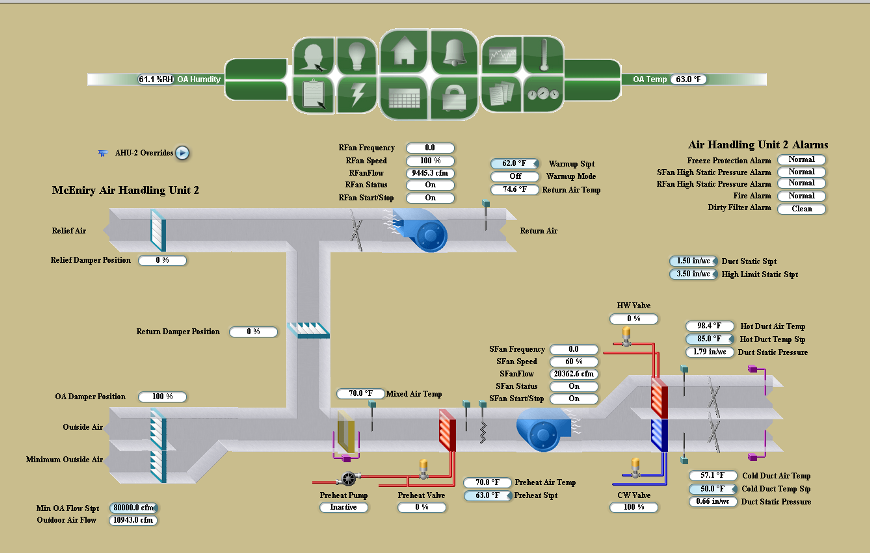
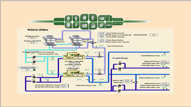
Most graphics tools were built to produce custom visualization for a
building operator, not an analyst or an executive. While valuable,
these graphics generally don’t serve the needs of other stakeholders
such as an energy engineer or sustainability director. Most
organizations must pay for more custom graphics to be designed or they
purchase another new software tool for additional stakeholders. While
these graphics provide a valuable service for someone who needs to
start a fan or view a single data set, they inherently can’t make the
essential and important connections among data and they don't show or
find the less obvious, much needed information to really run a building
or campus efficiently.
Data’s value to a business relies on human intelligence and is
predicated on how well managers and analysts formulate questions and
interpret results. More data doesn't mean you will get
"proportionately" more information. In fact, the more data you have,
the less information you gain as a proportion of the data (concepts of
marginal utility, signal to noise and diminishing returns).
Understanding how to use the data we already have is what's going to
matter most.
Enter innovative companies such as Activelogix, LLC
(www.activelogix.com).
Seeking to improve industry visualization tools,
we embraced a new paradigm of product management - Mass Customization.
Mass Customization is a play on combining the best of mass production
and individual customization. It is a thought movement that companies
should create greater variety and customization in their products and
services while retaining the benefits of mass production’s competitive
prices http://en.wikipedia.org/wiki/Mass_customization.
The basic idea
is simple: Make existing products and services more valuable to your
customers by building in more relevant data and personalized
information. A variant of Mass customization is Adaptive customization
- firms produce a standardized product, but this product is
customizable in the hands of the end-user (the customers alter the
product themselves).
Social Media is perfecting the concept. For example, use a traditional
navigation application to find the best place to eat. But please factor
in recent reviews, or more precisely, reviews by my friends. If my
friends are actually there now… that becomes the tie breaker! Now
imagine in our industry of Building Automation, Energy Management,
Sustainability, etc. having the power to offer a single software
license to an organization that allows each stakeholder to truly
individualize their own dashboard at the same or lower cost as
traditional graphics are delivered.
Today’s best dashboard tools are built to analyze, trouble shoot and
communicate (with systems and people). At Activelogix, we built our
PeriscopeTM dashboard (www.periscopedashboard.com)
tools to be
deployed cost effectively, customized for/by multiple stakeholders with
shortcuts to foster awareness to the masses. We use the model of the
app store to allow users to customize their Dashboard by
choosing which visualization apps (viewlets) should co-exist on their
real estate and we let them change their mind every day!
We recognize that a successful visualization requires an understanding
of 1) how to present information and 2) how to allow the presentation
to change based on the targeted audience. Ultimately, we want a
visualization that is targeted and communicating an idea that will
drive action. PeriscopeTM allows for different visualization
of the same
data based on positional differences.
For example:
An executive sees the following dashboard and immediately asks a direct
report why electricity cost is up 1.67% year to date versus budget when
he had been told a new energy management system would save costs?
Having a simple, high level viewlet allows the executive to quickly
find what matters.
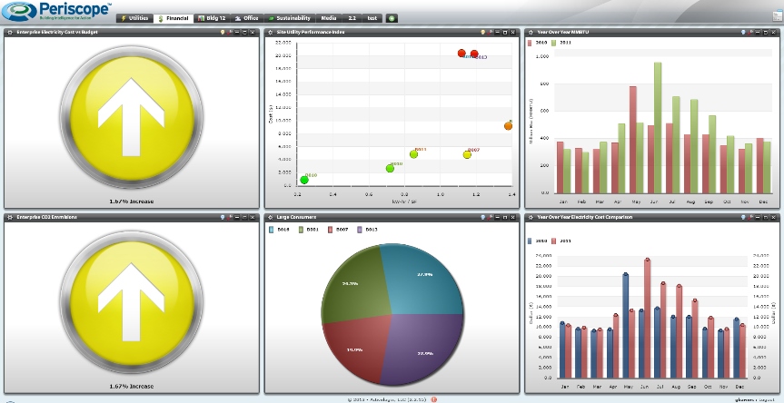
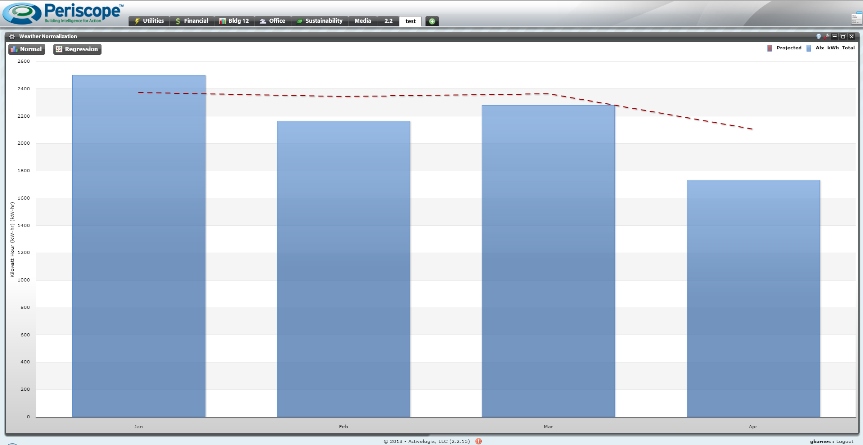
The building engineer reviews his dashboard and finds out that we had an unseasonably cold January that resulted in a 5% increase, but since January, usage has been below baseline. He then feels comfortable in telling the executive that he has confidence in the current energy management program and it is working for 2013.
There are three
broad reasons for visualizing data:
We see examples of Confirmation in the Executive Dashboard above and
Education in the Sustainability Dashboard below. Assuming the
visualization creator has gotten it all right, humans can often be
better at seeing the connections than any software is, though humans
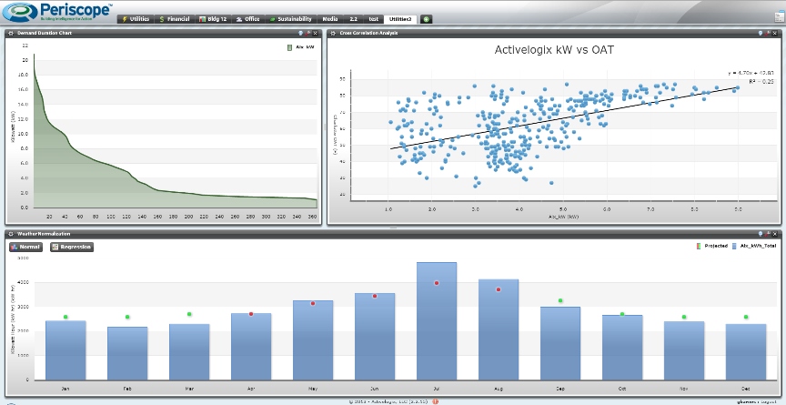
often need software to help. Consider the example of Exploration below.
In a PeriscopeTM Dashboard viewlet, a room temperature
sensor value is
compared with its heating and cooling setpoints both in occupied and
unoccupied timeframes. The controlled variable, space temperature, is
tracking between its occupied heating and cooling setpoints well, and
drifting during afterhours except for a few hours of hard to explain
overrides.
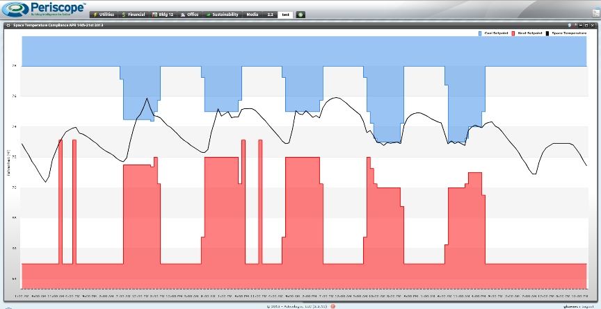
The Facility Manager can explore in the controls system to see why the set point was changed on the weekend if it causes concern or by writing a rule to catch these anomalies, he can automate the process for the future and automatically display every occurrence of this after hour’s usage for presentation to a tenant or a manager.
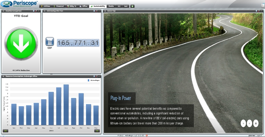
In the example Sustainability Dashboard below, we see examples of
Education. The corporation can share positive results with the team and
educate employees, tenants and visitors on other energy saving
opportunities or environmentally friendly tips. Another good example of
Education is the City of Raleigh NC using PeriscopeTM to
promote Electric
Vehicle Usage to their local constituents. View a live “published”
viewlet via a link on their website:
http://www.raleighnc.gov/environment/content/AdminServSustain/Articles/PublicEVChargingStations.html
Finally, we must understand that specialty expertise is always required
in buildings and having the right people analyzing the data is often
more important than the tool. If you don't understand what is happening
in the building, behind the trends, or in Space Temperature Compliance
visualization, you risk missing the savings, comfort or the needed
message to your occupants. Tools can make finding the needle easier and
facilitating problem solving, but they are just an enabler, an
accelerator or a magnifier of our industry experience and training, not
its surrogate.
Often a lone manager on staff may not have the training to find the
correlations in so many devices. Maybe the user has a specialty in
environmental control, but not in energy. With a tool like the
PeriscopeTM Dashboard, building owners can provide unique
logins to
third party professionals to analyze data and build dashboards for
them. Engage one of our Energy Management partners to
sub-meter your facilities, deploy the dashboard software on your secure
server, and build and analyze ongoing dashboards for you. Imagine
having a fractional Certified Energy Manager (CEM) that can support
your efforts remotely by building his or her own dashboard, sharing
this analysis of your energy consuming systems and checking back after
you made adjustments. Try asking a CEM to use your existing HVAC
graphics tool of choice and see how far they get!
[an error occurred while processing this directive]
[Click Banner To Learn More]
[Home Page] [The Automator] [About] [Subscribe ] [Contact Us]